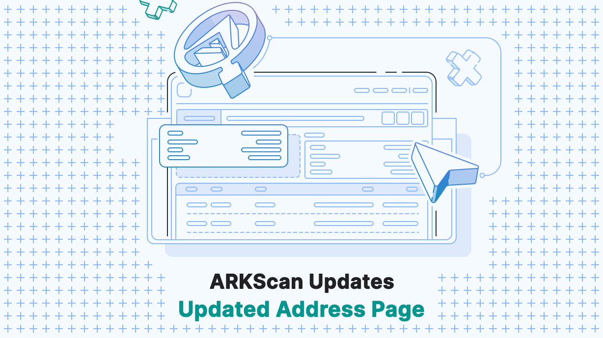
Our latest updates to ARKScan are now available. In this update, we have redesigned the individual address page to offer more streamlined informational boxes for items related to the address and their delegate (if registered). We have also added a fresh new table design that makes for a much more readable and organized presentation.
We understand the importance of easy-to-read information, which is why we’ve made significant improvements to enhance your reading experience. The latest update ensures that the information is presented in a way that’s easier on the eyes, making it effortless for you to scan and discover important details.
General Overview and Delegate Information Boxes

We’ve completely overhauled the individual address page, putting your address-related information front and center. With our redesigned layout, you’ll now find new informational boxes offering a comprehensive overview of both the address details and, if applicable, the relevant delegate information.
If the address is registered as a delegate, you’ll be presented with comprehensive delegate information, including rank, votes, productivity, and amount forged, along with the option to vote for the delegate using the ARKVault app. If the address is not registered, the delegate section will be blurred out. This means you can quickly grasp the essential details in an organized and structured way.
In the top right corner, you’ll also find icons that allow you to easily copy the address, view the public key, and access the ‘Send Funds’ modal.
New Table Design

We have redesigned tables on the address page, offering a significantly improved and more user-friendly way to view essential information. These updates have improved the presentation of incoming and outgoing transactions, facilitating better understanding and tracking of their origins and destinations. Transaction types have been made more visible by removing distracting elements, offering a more focused and intuitive viewing experience. Additionally, the readability of the table has been enhanced through color improvements, further enhancing the overall user experience. Furthermore, by hovering over amounts, users can now view the corresponding value of the Amount or Fee in USD. In the future, we plan to introduce the functionality of displaying values in the user’s preferred currency upon hover, as part of our ongoing improvements.
For addresses associated with delegates, we have introduced a convenient feature that allows you to seamlessly switch between the ‘Validated Blocks’ and ‘Voters’ tabs. By selecting the ‘Validated Blocks’ tab, you can easily view a comprehensive list of blocks generated by the delegate. Additionally, the ‘Voters’ tab enables you to access a complete overview of all the voters supporting the delegate. With this enhancement, you no longer need to navigate to different pages, as all the relevant information is conveniently accessible on the address page, providing a more streamlined and efficient user experience.
Improved Filtering System

We have made improvements to our transaction filtering system, providing users with a more versatile and efficient experience. The new system now enables you to filter transactions based on various options, including outgoing, incoming, and transaction types. Moreover, you can mix and match different filters to refine your search results further. To optimize the filtering experience, we have streamlined less frequently performed transactions into the ‘Other’ category, ensuring a more organized and streamlined view. These updates empower users to effortlessly navigate and locate specific transactions according to their preferences and needs.
Other Improvements
In addition, we have made improvements in optimizing loading times in opening Address pages, resulting in a big reduction in loading times. Depending on factors such as the age of the address, loading times have been reduced from several seconds to just a few hundred milliseconds in certain cases.
We have also improved the dark theme of the Address page and made general color contrast improvements. By enhancing the color scheme, we have made it easier for the eyes to access all the essential data. Furthermore, this new and improved dark color scheme will be gradually extended to other sections of the site as we continue making updates.
We believe that these updates will significantly enhance the overall user experience of ARKScan.
What’s Next?
Our next release will feature the new export function for the address page. This is one that many of you requested and we are excited to get in your hands. With this new functionality, users will have the ability to export transaction data and validated blocks, along with options to include all of the important data points your accountant may need to get you squared away.
Follow us on Twitter and keep checking the blog to stay up-to-date on all of our new releases. We post a weekly development report so you can easily see what we’ve been up to and follow along our journey towards making your decentralized future a reality.


